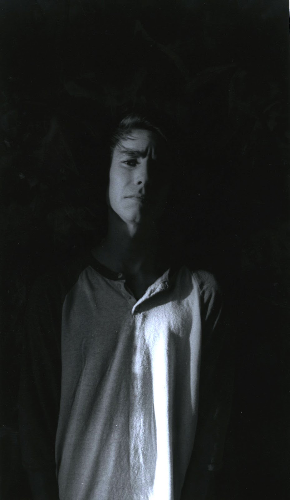
Emphasis:

Pattern:
I used a single tungsten light on black background with shanell wearing a pattern shirt to emphasize her expression and her shirt. There's no distractions in the background to detract from the floral pattern or any distractions anywhere else on her, other than her piercings. I like her position because it creates a sort of movement in the picture that keeps the eye around the pattern.

Balance:
In this picture of Yanel and Nathan, I used tungstin lighting on the background and no foreground lighting to create silhouettes. There's a symmetrical balance in the sense of the two being silhouettes, but in their shape, there's an asymmetrical balance. One is taller than the other and they were both directed to hold different hand position. Despite these contrasting features, the picture stays balanced because of the silhouettes. I like this picture a lot, I think I could have worked on the lighting a bit more though.

Rhythm/Movement:
I took this picture of the carousel in balboa park using a really low shutter speed to make the lights explore the page. The circular shape of the lights creates a movement throughout the print and the fencing/column moves the eyes up to the lights. The circular movement keeps the eyes inside the page, not leading it out. I like this picture because of this. To improve it, I think I could have taken a step or two back to include all the lights in it, instead of cutting off the last one or two. Had I done this, there would be no movement off the page.
No comments:
Post a Comment